STEAM
Reimagining the Steam Experience
Human Experience Design & Interaction
My Role: Lead UX/UI Designer
Team: Gage Brouse, Jasmine Banman, Finn Larson, Emi Jackel
Overview
Steam's primary services are to allow users to purchase games and connect with friends. With a 2.4/5 rating on the App Store, this app has historically been a frustrating tool for many users. Our team seeks to improve the user experience by reworking the log-in experience and addressing key navigation problems.
Project timeline:
Aug 2024 - Dec 2024
Understanding the problem
We started the project with lengthy primary and secondary research to better understand the user base we were designing for. The team conducted eight total interviews. Five users were already familiar with Steam, where we asked questions about any regular pain points they have experienced. Three of the interviewees were completely new to the platform, where we took a more observational approach as we watched how two individuals in particular struggle through the onboarding process.
We also went though hundreds of app store reviews of anything 3 stars or below that could give us some more insight into the usability issues within the app interface. See below for a few examples that we collected.
-
"The app is not user friendly. Tough to rate games. Search box is hidden. Decided to delete the app."
Apple Store Review 2024
-
"You can't even log in. It's a never ending cycle of verifying and then repeating to no avail."
Apple Store Review 2024
-
"Doesn't show what friends respond in the app. Slow, clunky and it's like everything is hidden."
Apple Store Review 2024
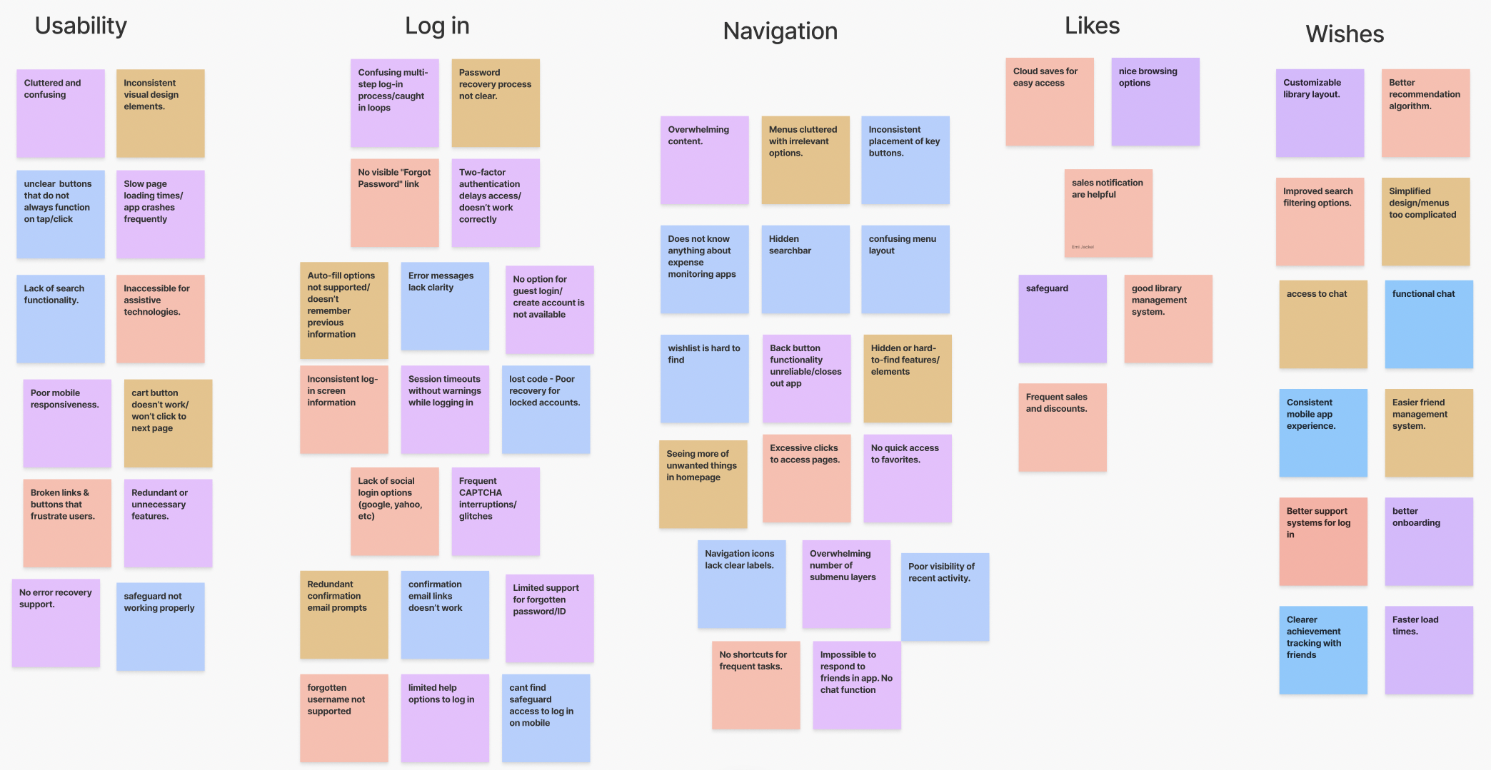
Affinity Mapping
We used affinity mapping to extract 3 key insights from our research:
Navigation challenges: Users struggle to locate basic features, leading to frustration and app abandonment.
Log-in process is broken: The log-in system is unreliable, with repetitive verification loops preventing access.
Key social features are missing: The app lacks essential communication tools like chat integration, making it difficult for users to connect with friends and respond.
User Personas
Understanding the needs of our users was vital to our teams design process. By creating well-defined user personas, we were able to put a name and a face to the individuals who we are designing for. This process helped us to focus our efforts and build empathy throughout our research stage.
We created two user personas. Meet Alex and Hannah.
Information Architecture
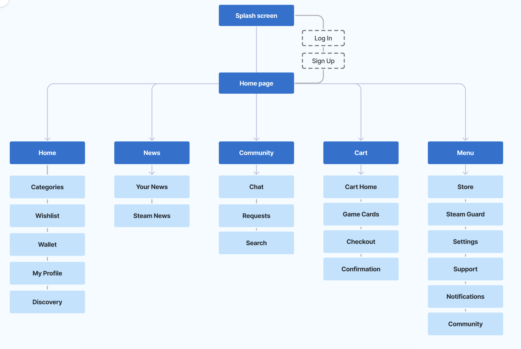
Before jumping straight into design, we wanted to build a better app structure. Since people navigate an interface differently, I was responsible for providing a clear information system tailored to as many different types of people as possible. Utilizing the Principle of Choices, I wanted to make sure that users never feel overwhelmed by too many choices when navigating the app. Instead, I chose to limit the number of options available at any given time and eliminate any excessive information. This allows users to focus on the task at hand without feeling confused.
Creating this diagram helped us to have a clearer idea about the effort needed to design all of the screens and begin to address certain navigation problems that have been mentioned throughout numerous app reviews and user interviews. By creating this diagram, we were able to effectively organize the Steam UI in a more logical way to help the user more easily find what they need.
Designs
To start, we wanted to address the key issue of logging in. Many users have reported that they will stay locked out due to Steam Guard authentication. To fix this issue, we decided to provide a backup option that allows users to input their OTP in order to escape the endless authentication loop.
We then designed the rest of the key screens. Throughout our research, we realized that the Steam Guard icon in the navigation bar should be added to the settings tab, as it is not frequently used since most users prefer to save their login information. In place of the Steam Guard Icon, we have modified the Community tab, where chat, friend requests, and friend searches are consolidated into one page.
Log In & Account Recovery
Key Screens
Results
At the end of our UX course and semester, we compiled a report to Utah State University’s Human Experience Design & Interaction advisor, complete with all of our research findings and the interactive Figma prototype.
We presented our project for the Fall 2024 UX/UI design course and received full marks.
I learned a lot from this project about information hierarchy and app creation, and I also worked on soft skills for collaborating with cross-functional teammates and communicating with users during testing. I know this one was a long one, so thanks for reading!


